


Substantively, a good week for Trump
And a good week for the fight against national bankruptcy

This is what federal spending looks like:

The year Ronald Reagan was elected, it was about 600 billion. The year George W. Bush was elected, it was two trillion. Now it’s seven trillion — three and a half times that — with a steeper upward slope than we’ve had, ever, with only two exceptions, WWII and the pandemic of 2020 - 2021.
This is interest on the national debt:
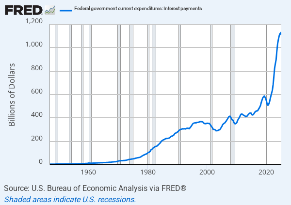
The annual interest we are paying now is well over a trillion dollars and more than twice what we were paying less than five years ago. As you can see in the recent almost vertical upward slope, it’s headed through the roof, if there ever were a roof.
This cannot continue. We are living grossly beyond our means, immorally leaving to our children and grandchildren whatever grotesque ending this is going to have. Even Reagan couldn’t stop it, although he was better at it and took it more seriously than any other President in my lifetime.
Much of what Donald Trump has done with his Presidency in his second term has been irresponsible and thoughtless, but today the New York Times, of all things, brings us a story about Trump’s spending proposals that I’ve been waiting to read since high school. The Times of course frames it as a rebuke. In fact, if it ever comes about (admittedly unlikely at best), it’s more like a road to fiscal redemption. Here’s the headline and the sub-head:
Trump Proposes Slashing Domestic Spending to the Lowest Level of the Modern Era
The president’s $1.7 trillion discretionary budget blueprint would cut $163 billion for the 2026 fiscal year, offering an outline of his vision for Washington and dramatically curtailing the role and reach of the federal government.
This isn’t going to happen, because Congress doesn’t have the guts, but this is the fiscal leadership we’ve needed since forever.
The story begins:
President Trump on Friday proposed slashing $163 billion in federal spending next fiscal year, a drastic retrenchment in the role and reach of government that, if enacted, would eliminate a vast set of climate, education, health and housing programs, including some that benefit the poor.
Ahhhhhh yes, the poor. I’m surprised it wasn’t “poor children with cancer” — the few who Trump hasn’t deported yet. (On the other hand, I haven’t seen tomorrow’s NYT headline).
Issuing his first budget proposal since returning to office, Mr. Trump sketched out a dim view of Washington. His blueprint depicted many core government functions as woke, weaponized, wasteful or radical, as the president looked to justify his request that Congress chop domestic spending to its lowest level in the modern era.
Record-Low Funding for Domestic Programs
President Trump’s budget proposes shrinking nondefense funding to its lowest level since the 1960s, when these records began.

The Times wastes no time going on the warpath.
He recommended striking billions in funds that help finance clean water projects. And the president reserved some of his deepest cuts for education, health and science, including the National Institutes of Health and the Centers for Disease Control and Prevention, which would see their budgets cut by around half.
Democrats immediately rebuked Mr. Trump for his proposal. Senator Chuck Schumer of New York, the Senate minority leader, called it “heartless” and an “all-out assault on hardworking Americans.”
There are those of us who think that “hardworking Americans” pay their own bills and are responsible for their own lives. But that is sooooooo yesterday.
Mr. Trump also asked Congress to reduce, if not eliminate, billions of dollars in federal aid to help the poorest Americans. For one, the White House called for reconfiguring federal programs that provide rental assistance to low-income families, cutting aid by more than $26 billion next fiscal year. And the administration proposed the termination of a federal initiative, backed by some Republicans, that aids needy families in paying their monthly heating bills.
In one of the few spending increases included in the budget, Mr. Trump asked lawmakers to bolster spending at the Department of Homeland Security by more than $43 billion, furthering his work to crack down on immigration, conduct deportations and build a wall along the U.S.-Mexican border. The president also requested more than $1 trillion for the military next fiscal year.
As noted, only a fraction of Trump’s plan is going to get enacted, but even making the proposal, even if not much more than a gesture toward sanity, is a lot more than we were going to get with Kamala (or, to be honest, virtually any other Republican).
When Trump goes off the rails, or worse, Paul and I have taken note, often loudly. When he gets something important right, as he did today, he deserves credit.
UPDATE: I want to add some commentary I received from my friend and Ringside subscriber Prof. Dan Lowenstein of UCLA. I was so happy to see Trump submit a budget that had the NYT reaching for its smelling salts that I neglected to note that we actually need to go farther than Trump does. As Dan observes:
The increase for the military should be greater. We should be on more than a full cold war footing, partly because we have a lot of catching up to do and partly because we are very possibly not far away from a hot war. China’s declared date for taking Taiwan is 2027, and I see no reason to doubt they will invade in that year. But at least the increase is something.
The budget cut is welcome, but until and unless we take some savings from entitlements, any such cut is a band-aid for cancer. A lot can be achieved with addition of a couple or a few years to the retirement age for Social Security and Medicare. One of the many reasons for disliking Trump is that he rules out all such changes. And getting middle class people off of Medicaid can not only save money but improve the quality of care for the people who actually need Medicaid.
Hear, hear!!
There is no doubt that federal spending and the federal deficit have gone up dramatically during the period in question, but the graphs seriously exaggerate the rate of acceleration in two ways. First, and most obviously, they present nominal dollars and not dollars adjusted for inflation ("real" dollars).
Second, the graphs are linear, whereas to get a realistic sense of degree of acceleration one needs logarithmic graphs. Thus, in the first graph, each horizontal line represents spending one trillion dollars more than the next lower line, and the space dividing each pair of lines is identical. As a result, an increase from four trillion to eight trillion looks four times greater than an increase from one trillion to two trillion, even though each is a doubling. A logorithmic graph would flatten the curve, so that an increase from one trillion to two trillion and an increase from four trillion to eight trillion would show a change in height of equal size. It gives a much more accurate sense of the rate of change than a linear chart.